Search highlighting
Description
Specify if search values in the List should be highlighted. Applies when the List is filtered on the server-side using the 'Filter records in a List' action in Action Javascript, or on either the client-side or server-side if the List is filtered using the 'Search Part'.
To see how to add search highlighting to a List control watch this video or read the guide below.
Adding Search Highlighting to a List Control
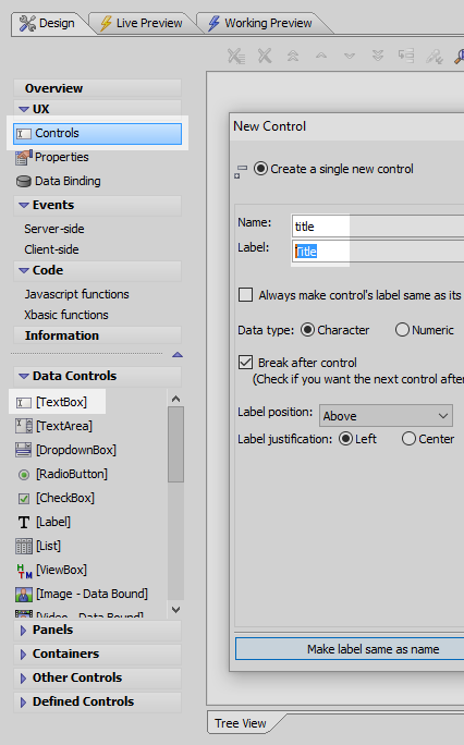
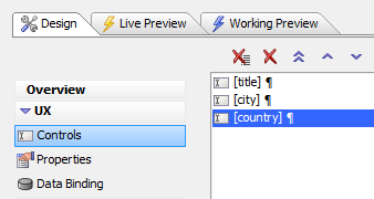
Open the UX Builder. On the UX Controls page open the Data Controls menu find the [TextBox] option. Click to add a textbox control to your component. Name the control "Title"
Add two more textbox controls to the component. Name these controls "City" and "Country".
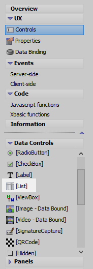
Go back to the Data Controls list and click to add a [List] control to the component.
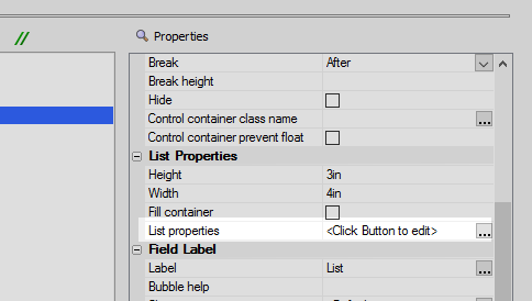
Highlight the list control. Scroll down the 'Properties' list, on the right of the UX controls page, and find the List Properties section. Click on the List properties property to open the List Builder.
 Alternatively you could double click on the list control itself.
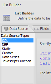
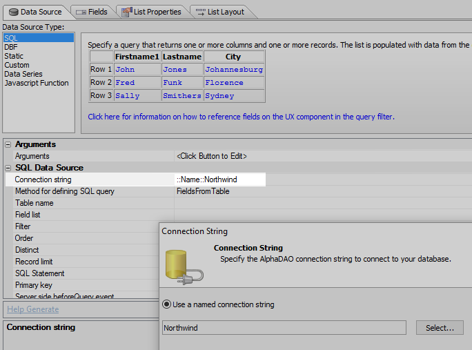
Open List Builder's "Data Source" pane. Under the 'Data Source Type:' menu select SQL.
In the SQL Data Source section that appears set the "Connection string" property" to the Northwind database.
Click the
 button next to the "Table name" property and set it to the 'Customers' table.
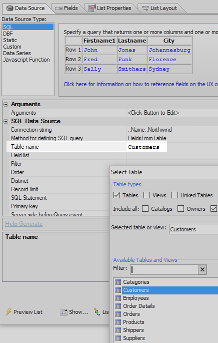
Click the
button next to the Field list property and add the following fields:
ContactName, Address, City, Country, PostalCode, Phone, and ContactTitle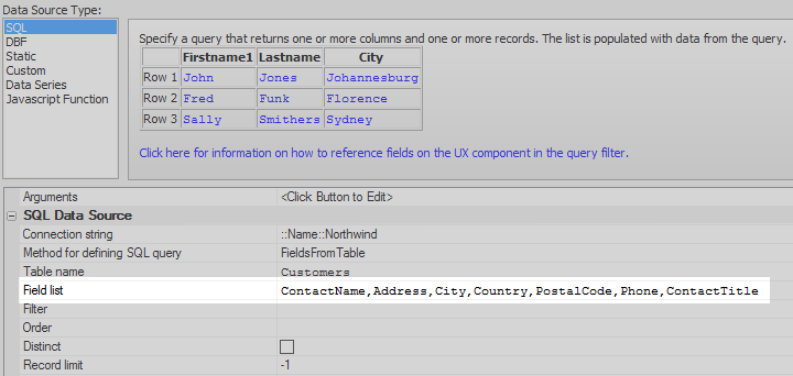
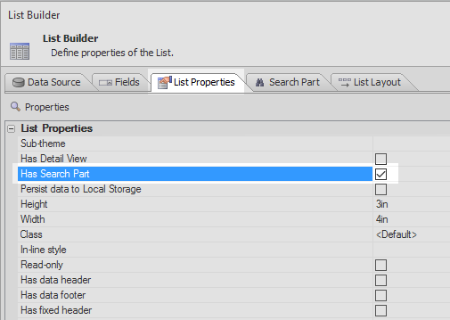
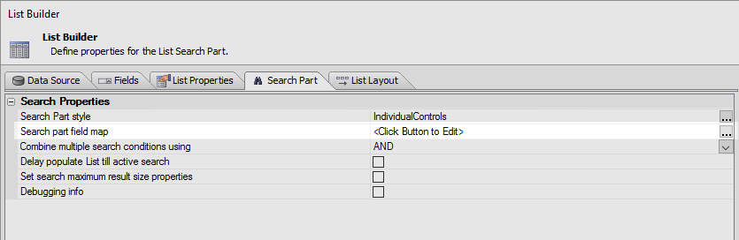
Open the List Properties pane and in the List Properties section check the "Has Search Part" property.
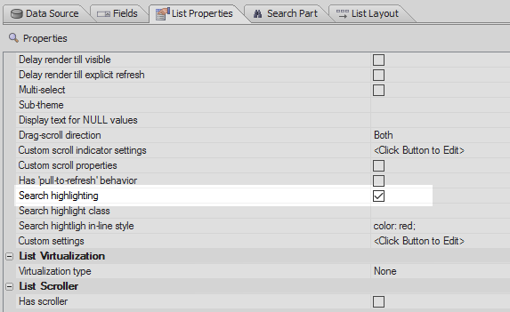
Check the Search highlighting property towards the bottom of the List Properties section.
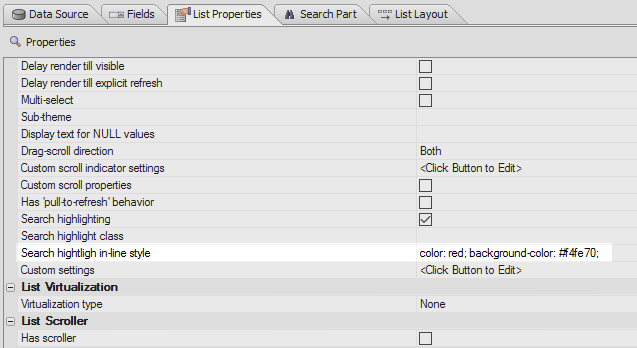
Just under the Search highlighting property add the following CSS next to the Search highlight in-line style definition.
color: red; background-color: #f4fe70;
Open the Search Part pane. This is hidden until 'Has Search Part' is clicked in List Properties. In the Search Properties click the
button next to the Search part field map property.
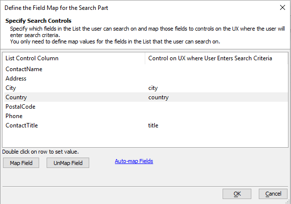
Highlight the Country field and click Map Field button. Map the Country field to the 'Country' textbox control that you defined.
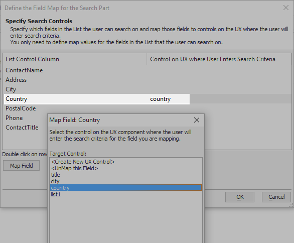
Map the 'ContactTitle' field to the 'Title' textbox and the 'City' field to the 'City' textbox. Click OK
In the Search Properties pane set the 'Combine multiple search conditions using' property to OR.
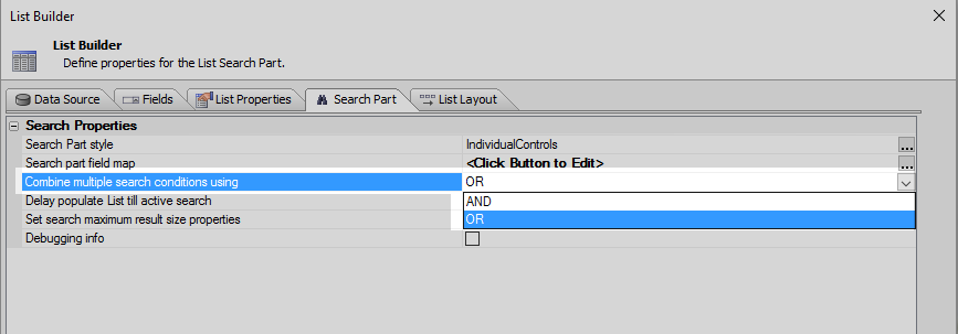 If OR is selected, when you do a search that utilizes all three textbox controls it will show the separate search results from each box in the list. The other option, 'AND', filters the list down to only a few rows where all three of the conditions entered in the textboxes apply.
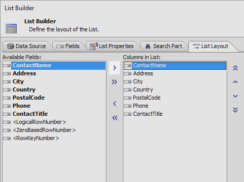
Go to the List Layout pane. Highlight all of the fields that you added and use the blue > arrow to move them from the Available fields list into the Columns in List part of the pane. Click OK to close the List Builder.
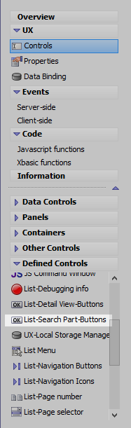
On the UX Controls page open the 'Defined Controls' menu. Locate the "List-Search Part Buttons" option and click on it to add it to the component.
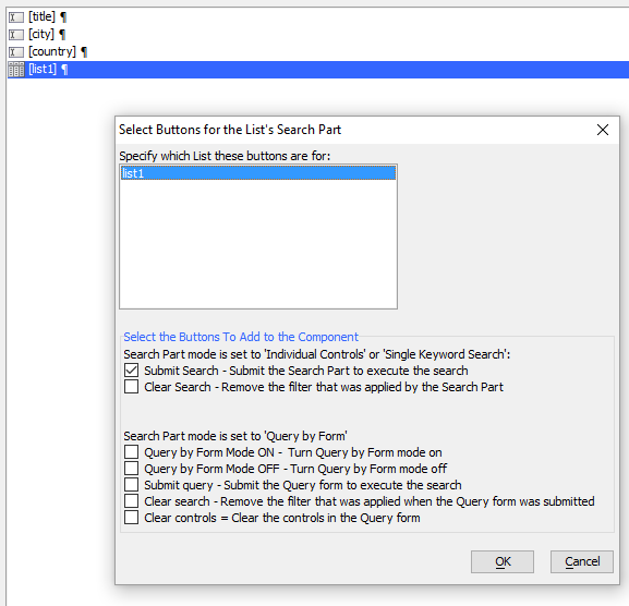
Confirm the list that you want to attach the button to, check the 'Submit Search' option, and click OK.
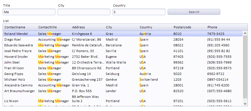
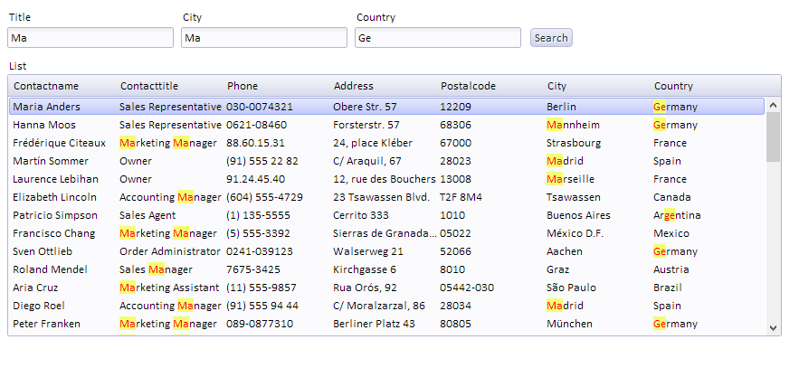
Run the component in Working Preview. Enter text to search for into the textboxes and click Search. You should see the search results highlighted.
See Also